
SafeRide App Redesign
Reimagining how students get home safe.


Background
For my independent senior thesis project, I chose to redesign Iowa State’s SafeRide app. SafeRide is a ride service run by the Iowa State Police Department that allows students to get free rides around campus late at night by either calling or booking a ride with their app. However, the app was plagued by a number of UX issues that made using it a nightmare, and I was approached about the possibility of redesigning it.
Tools
Sketch, Invision, Adobe InDesign, Balamiq
Skills
User Research, Wireframing, Prototyping, User Testing, Visual Design
Final Deliverable
High-Fidelity Clickable Prototype
User Research
I began this project by talking to a number of regular users (both riders and drivers) about their experience with the app. From there, I was able to create some user personas to help me get a better idea of the type of users I was designing for.


Additionally, I also created a journey map to help me get a better idea of where there was room for improvement within the process.

The Problems
Through my research, I managed to come up with four main pain points that caused problems for users:
1. Wait Times & Pooling
-
One of SafeRide’s biggest issues is the wait times that build up. In fact, 28% of all rides were cancelled in 2017, and about a third of those were directly due to wait times being too long.

-
One way the app combats this is by giving drivers the ability to ‘pool’ rides, (pick up multiple people with similar locations or destinations).
-
However, this process is extremely inefficient as it relies on the drivers to decide when and how to pool riders.
-
Additionally, students are not notified when it happens, which can lead to confusion when they see someone getting in the car they thought was for them. Also, students may feel uncomfortable riding with a stranger.
2. Lack of Feedback
-
After a student requests a ride, there is zero feedback as to whether their request was sent, their wait time, or how many riders are ahead of them.
-
Once a driver has accepted the ride request, their ETA and location is shown on the screen. However, if the student isn’t looking at the screen, they won’t know their ride was accepted until the driver sends them a message saying that they have arrived.


3. Finding the Car
-
Another issue I found is that when the car arrives, students will often have trouble finding exactly where it is parked, leading to a lot of unnecessary confusion.
4. Off Hours
-
During off hours (between 5:30am and 6:00pm) the app has essentially zero use.

Initial Prototyping and User Testing
Once I was able to wrap my head around all of the problems I needed to solve, I took to Balsamiq to start figuring out some solutions.

I then conducted user tests with five students who use the app regularly. The goal of this round of testing was to start getting some feedback about the new features I came up with as well as making sure they understood how to complete common tasks with it.
I will discuss the insights I gained from this process and how they helped me solve each problem in the 'Final Design' section.
Refinement
I then used what I learned thus far to create a higher quality wireframe in Sketch.
From there, I created a prototype in InVision and began another round of user testing. This time around, the goal of the user testing was more focused on:
-
Making sure users could easily request and schedule a ride, and
-
Confirming that users found all new features necessary and useful.
Fortunately, the app was successful on both of these counts.

My Solutions
Here are each of the main pain points and how I solved for them. You can also click to take a more in-depth look at my thought process behind each solution.
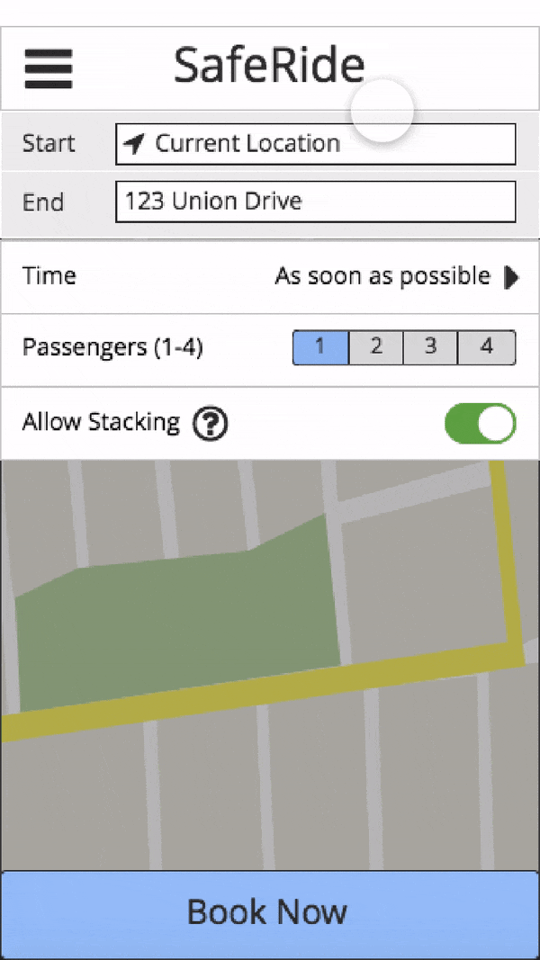
1. Wait Times & Pooling
-
The app automatically pools riders together that have similar locations and destinations.
-
Allows users to toggle pooling on and off.
-
Riders can also choose to schedule their ride in advance so that their ride is there when they are ready.
-
Riders are notified when they are pooled with another rider.
Click here to learn about the insights that lead me here


Pooling
The moment I learned that the drivers were the ones responsible for pooling riders together, I knew that would be something I had to focus on. Early on, I also discovered that most riders weren't aware of this feature until they experienced it. This lead to instances of people being confused when they saw someone getting in a car they thought was for them, and feeling uncomfortable due to unexpectedly riding home with a stranger. To combat this, I decided to allow users to toggle pooling on and off. With this, I included a small explanation of what pooling was and why it was beneficial. Here is how I handled this in the initial prototype:
When testing the initial prototype, I discovered a few things that needed to be changed:
-
Most users thought the original name of the feature, 'stacking,' was unclear.
-
Most users didn't bother clicking on the explanation before moving on, so I decided to make it always visible.
-
The explanation needed to make it clear that pooling could only make wait time shorter for you.
I also chose to add some text on the 'driver has arrived' screen letting users know if they will be riding with any additional riders.


Scheduling for Later
One major reason for cancellations was that people weren't ready. Some students I talked to said they would schedule a ride way before they were ready to go because they knew it would be so long. However, due to the unpredictability of wait times, there was no guarantee that they would actually be ready to go when the ride got there. Thus, I decided to give them the ability to specify when they would be ready. They would then be put at the back of the queue, and held there until the ETA matches what time they want to be picked up. Users all liked the idea of this feature. Another thing I made sure to test was whether my system for choosing a time to be picked up was intuitive, but there didn't seem to be any issues with it.

2. Lack of Feedback
-
Continuous feedback lets the user know that their ride is being processed.
-
Notifications let users know when their ride is on the way and when it has arrived.
-
Riders are warned that their driver may leave after waiting for 10 mins (they were not notified of this before).
Click here to learn about the insights that lead me here
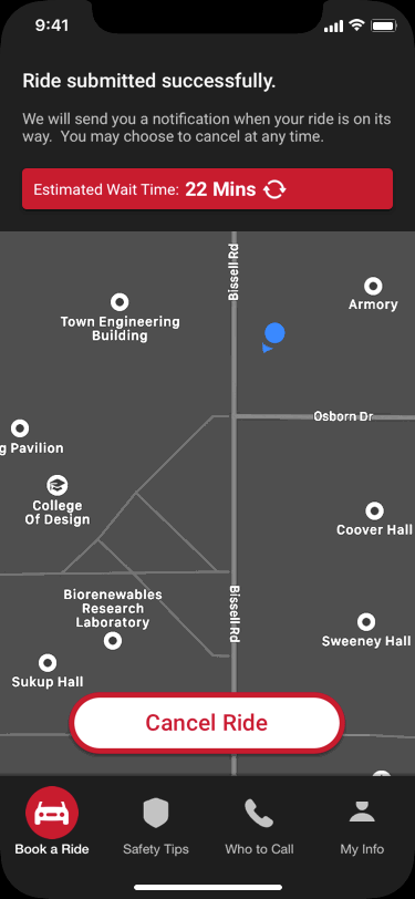

Lack of feedback was what I personally considered to be the biggest problem with the app in its' previous state. In fact, when I tried to use the app the first time, I ended up cancelling my ride twice since I couldn't tell whether my request had gone through and it didn't tell me how much longer I needed to wait.
Fixing this problem really just came down to adding basic affordances to help riders know the status of their ride at all times:
-
Showing that ride requests had successfully gone through
-
Making sure wait time was always visible
-
Ensuring that riders were aware of exactly when their ride would be arriving
3. Finding the Car
-
Continuous feedback lets the user know that their ride is being processed.
-
Notifications let users know when their ride is on the way and when it has arrived.
-
Riders are warned that their driver may leave after waiting for 10 mins (they were not notified of this before).
Click here to learn about the insights that lead me here
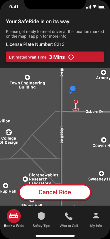
-
One common complaint from users was having trouble finding their ride once it arrived. To solve this problem, I first started looking at how ride sharing companies like Uber handled this. However, I soon realized that SafeRide has a big advantage over traditional ride-share services in that it only gives rides in a small area full of landmarks. Thus, I decided that the best idea would be for each building to have designated "pick-up points" in the form of landmarks or one of the many well-lit bus stops located throughout campus.
-
When gathering feedback about this idea from students and drivers, the response was extremely positive as this was a very simple fix to a common problem they often faced when using SafeRide. However, during my second round of user testing, some users questioned how easy it would be to find the pickup point if the student was unfamiliar with that area of campus. Thus, I decided that it might be helpful to include a picture of the pick-up point next to the marker.
4. Off Hours
In the previous version, the app was essentially useless when the service wasn't running. In my redesign, I added features that allow users to:
-
Schedule a ride for later.
-
Learn how to stay safe while walking home at night.
-
Learn about who to contact (and contact them) in case of various emergencies.


Click here to learn about the insights that lead me here
I also decided to make it so that people could schedule a ride during off hours. This served two purposes:
-
Giving users another way to make sure they would have a ride when they needed it, and
-
Giving the app more functionality during off-hours.
One of the first questions that came up during this process was how far in advance people should be able to schedule rides. During user testing, no users said they would request one earlier than the day they needed it, so I chose not to include a date picker when scheduling the ride. I also made sure to warn them 2 hrs before scheduled so they don't forget to cancel if they don't need it so that there is less of a chance of people missing their ride.
Interactive Prototype
Here is a clickable prototype of my final design (made using InVision). You may also find the prototype here.
Revisiting Visual Design
The screens you see above were actually designed about a year after the original completion of this project. In December of 2019, I challenged myself to use my improved visual design skills to go back and give this app a more modern, elegant design. The most significant changes I made include:
-
Modern design
-
Optimized for latest generation of iPhones
-
Both light and dark mode versions
-
Replaced hamburger menu with a more user-friendly bottom menu


Original Design


New Design - Light and Dark Modes
What I Learned
-
This project presented a unique challenge in that it was the first project I have done completely solo. The experience really taught me the value of having people to collaborate with, and helped me become more comfortable with my ability to make important design decisions using my own best judgement.
-
During my first go at the visual design of the app, I think I was too hesitant to really break away from the look and feel of the current version. However, on my second pass at it, I feel as if I was much more confident with my own visual design skills, which made quite the difference.