VitalShare
Improving communication between doctors and patients.


Purpose
VitalShare is an app that allows users to effortlessly keep track of symptoms and questions, and then seamlessly relay this information to their doctor in order to ensure that they have all relevant information when making a diagnosis.
Background
VitalShare was created for a class project with one simple objective: design a new user interface that addresses a current problem. I was part of a four person team, with whom I collaborated during the planning, research, ideation, and testing phases of the project. Additionally, I did all of the wireframing and prototyping for the app.
Challenges
This ended up being one of the most challenging projects I've ever done from a collaborative perspective. Our four person team was spread across three different timezones, and we all had very different schedules. Because of this, we were usually only able to meet live for 1-2 hours per week, with the rest of our communication being text-based.
Tools
Adobe XD, Adobe InDesign, Adobe Photoshop
Skills
User Research, Wireframing, Visual Design, Information Architecture, Prototyping, User Testing
Final Deliverable
High-Fidelity Clickable Prototype
User Research
Coming into the research phase, we wanted to learn all about the challenges doctors and patients faced when communicating with each other. We interviewed 4 doctors and 10 patients about their experiences, and found that there was a large gap in communication between them that made it extremely difficult for doctors to make a diagnosis. When looking at what was causing this gap in communication, we found three main opportunities for improvement.
Opportunity #1
Patients often forget or neglect to mention important pieces of information to doctors. At the same time, doctors said that one of the main reasons they misdiagnose people is due to them neglecting or forgetting to mention symptom information.
Opportunity #2
Patients will often fail to track their symptoms between appointments, making it difficult for them to remember all of the changes to their health that took place since their last visit.
Opportunity #3
Most patients interviewed reported just 13-16 minutes per visit with their doctor. Having to complete the appointments so quickly often meant that patients were rushed and failed to mention potentially important information.
Personas
I then synthesized our research into two user personas to guide our design decisions.

Market Research
We found that there were apps on the market (like MyChart) that allowed patients to share info with doctors, and apps (like Symple Symptom Tracker) that allowed patients to track symptoms.
However, there was nothing on the market that allowed patients to track their symptoms and tell their doctor about new or worsening symptoms in one place. Thus, that was the direction we decided to take for this project.


MyChart

Symple Symptom Tracker
Ideation
To begin the ideation process, we each sketched out some ideas and then came together to discuss what features to include and how to lay everything out. Our research found that people often forgot to ask their doctors questions or tell them about symptom changes during appointments. Thus, we decided that the app should allow users to keep track of questions and symptoms and then email this information to their doctor.


From there, I went ahead and started planning out the app's basic information architecture. As mentioned, the app's main functionality is to keep track of symptoms and questions and send them to the doctor. Additionally, we decided to add a way to keep track of upcoming appointments, set reminders for them, and get reminded of questions and symptoms during the appointment. While working out the information architecture, we realized that in order to allow users to send info to their doctors, we needed to get their doctors' information. Since many of the users we talked to saw multiple doctors for different things, we decided to also add a whole 'doctors' section where they could have a list of all the doctors they were seeing and add more as needed.

Initial Prototype
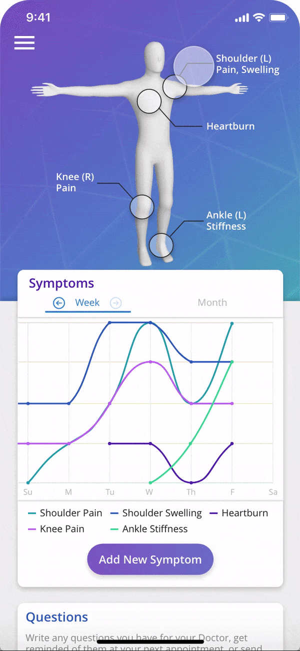
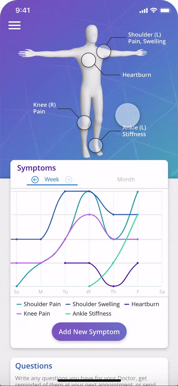
From there, I started creating our first prototype in Adobe XD. As I was creating this prototype, I ended up continually making adjustments based on both ideas I had and the input of my group members. The most important thing that came out of this was the idea of the body depiction, which is one of the app's defining features. We chose to use the body depiction to add and track symptoms because we suspected that being able to tap on a the body part that is in pain would be easier and more intuitive than having to search for it or find it in a list. (Later during the testing phase, we were able to validate this hypothesis as being true.)
Similarly, we also wanted to make sure that users would be able to quickly and accurately input the appropriate severity for each of their symptoms on a given day. We did this by associating each rating with a color based on the severity, which we felt would be a helpful visual cue.

Initial User Testing
At this point we looked to our classmates for some feedback. This process was done in the form of a heuristic evaluation where they evaluated our design based on a set of recognized usability principles, from which we were able to gain a number of insights. Here are four that I felt were particularly valuable:
Issue
Process for adding new symptoms too difficult and imprecise.
Solution
Added functionality to search for a symptom as well as the ability to zoom in and out.


Issue
User never sees any confirmation when they successfully complete a task such as submitting a report or tracking a symptom.
Solution

Added confirmation message after a report is successfully sent, and changed the color of the circle around a symptom to match severity as a form of visual confirmation.


Issue
Date selection process goes against established conventions and is therefore unintuitive for users.
Solution
Changed date picker to better reflect established conventions.

Issue
The main page of the 'Doctors' tab was cluttered and disorganized.
Solution
Added a way to sort doctors and moved more detailed info to a deeper page.


Validation
While I continued to iterate on the original prototype, my group and I began planning out how we would validate our design. We believed that the two key differentiators between VitalShare and other symptom-tracking apps were our more intuitive way to track symptoms using the body depiction, and our more streamlined way of communicating symptom changes to their doctors. Thus, we chose to test this functionality against a popular symptom-tracking app called Symple Symptom Tracker.
The goal of these tests was to determine whether our app did, in fact, make it simpler and quicker for users to track their symptoms and send symptom information to their doctors.
Method
We measured and compared the completion time, user satisfaction, and mental workload of nine users who completed two tasks on each of the apps. The two tasks were:
1. Tracking a symptom
2. Sending a report to their doctor
For each of these tasks, we measured how long it took users to complete each task. Then we measured their mental workload using the NASA TLX (Taskload Index) workload assessment survey. Finally, we measured their user satisfaction using the System Usability Scale (SUS) survey.

Results
We found that in task 1 (tracking symptoms), VitalShare outperformed the other app. However, in task 2 (sending a report to their doctor), there was no significant difference between the two apps. This means that our app did in fact make it easier for users to track their symptoms with our body diagram layout.
What I Learned
This project was great for allowing me to get some hands on experience with the UX research, testing and validation methods I was learning in class at the time. It also taught me a lot about how to successfully collaborate with people remotely as the four of us were in three different time zones and all had very different schedules. This became especially challenging during the wireframing phase when we all had slightly different visions for the app, but we were able to get through it through constant communication and compromise. Overall, it was definitely a challenging project, but we managed to overcome those challenges and get an A on the project, and I'm very happy with how it turned out.
2020 UI Redesign
About a year and a half after this project was originally finished, I decided to use the skills I'd gained to revisit this project and make some improvements.
1. Improving Overall UI/Visual design
I designed this before I understood many of the principles of graphic design and modern mobile UI design. In revisiting the design, my goals were as follows:
-
Use a cohesive design style and brand language throughout the app. In order to create a new visual identity, I began by redesigning the color scheme, creating a moodboard, and creating a logo and app icon.


-
Update UI design to be more visually appealing and adhere to today's mobile design best practices. I drew inspiration from apps like Acorns and Clarity Money which I believe are two of the most visually appealing apps on the market today. Acorns also does a great job of simplifying complex tasks for users. I also drew inspiration from SymptomTracker, another symptom-tracking app that I felt did a good job of presenting data in a digestible and visually pleasing way.


Acorns

Clarity Money

SymptomTracker
2. Improving Information Architecture
The most glaring change that I decided to make to VitalShare's information architecture was the removal of the bottom menu bar. Bottom menu bars make all of the main features in an app equally accessible. However, this setup wasn't ideal for VitalShare since the 'Doctors,' 'Appointments,' and 'Send Report' sections are all more peripheral features that could potentially distract users from the main goal of keeping track of their overall health.
Thus, I chose to lay out the app in a way that would bring the primary features to the forefront, and keep the other features in the background until they are really needed. Here is an explanation of the decisions I made in order to accomplish this.
Primary Features


The ability for users to track symptoms and write questions for their doctors are the app's two primary features, so I made sure they can both be seen upon opening the app.
Additionally, based on what I've seen in other symptom-tracking apps, a graph of how a symptom has progressed is typically a primary, quickly accessible feature. However, in VitalShare's original design, the process took two taps and wasn't very clear. Additionally, the way I had previously designed it meant that you could only see the progression of one symptom at a time, which can prevent users from seeing potentially important patterns in their health.
Peripheral Features
Upcoming Appointments
While the ability to view upcoming appointments is nice, it doesn't need to be immediately viewable or accessible from the homepage like the two primary sections.
Additionally, adding appointments can be done at other times such as when viewing a doctor's profile page or when choosing when to be reminded to ask a question (right).


Sending Reports


I put the 'Send Report' feature below the 'Upcoming Appointments' feature on the homepage since users are unlikely to enter the app with the sole intent of creating and sending a report. Rather, sending reports is primarily something that should be done immediately after tracking a symptom or writing a question (left).
However, there is an exception to this. In order to ensure that their doctor has all relevant health data before an appointment, the 'Send Report' section is brought to the top of the page on appointment days (right).
Doctors
When it came to the Doctors section, I realized that while it is necessary for doctor information to be a part of the app for sending reports, the ability to view and add doctors should be more of an ancillary feature since it is unlikely to be used all that often. Thus, I put this section in VitalShare's hamburger menu with the other ancillary features (left).
Additionally, adding doctors can be done at other times when needed. For example, if users want to send a report to one of their doctors, but don't see that doctor listed yet, they can add them tapping 'Add a Doctor' on the 'Send Report' page (right).


Final Design
Track
-
The body diagram makes pinpointing and entering symptoms intuitive.
-
Track multiple symptoms from the same body part.
-
Add and view notes about symptoms.
-
Track how severity has changed over time.
-
Get daily reminders to track your symptoms.

Ask
-
Enter questions you want to remember to ask later.
-
Set reminders that trigger ahead of doctors appointments.
Remind
-
Never forget to ask doctors important questions.
-
Make sure they are fully updated on symptom progression prior to appointments.


Send
-
Send questions, symptom progression charts, and notes to your doctor.
-
Reports get sent to doctor's email.
-
Patients receive the response through their email.


Interactive Prototype
Here is a clickable prototype of my final design (made using Adobe XD). You may also find the protoype here.